Statistics » Pie chart
What is a pie chart?
A pie chart is a schematic representation of data within a circle.
Below you can see an example.
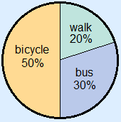
The different parts are called sectors.
The sector 'walk' is light blue.
This sector has a sector angle of 20 : 100 × 360° = 72°.
How do you draw a pie chart?
You first have to calculate the size of the angles.
You can calculate the size of the sector angles by using ratio tables or with the formula sector angle = number : total × 360°
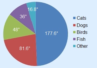
Example
A number of pupils is asked what their favorite pet is.
The results are in the table below.
| Cats | 74 |
| Dogs | 34 |
| Birds | 20 |
| Fish | 15 |
| Other | 7 |
Draw a pie chart for this data.
First we need to know how many pupils have been asked.
74 + 34 + 20 + 15 + 7 = 150 pupils.
Now we can calculate the sector angles.
With a ratio table:
| number of pupils | 150 | 1 | 74 | 34 | 20 | 15 | 7 |
| angle in degrees | 360 | 2.4 | 177.6 | 81.6 | 48 | 36 | 16.8 |
Or with the formula:
| 74 : 150 × 360° = | 177.6° |
| 34 : 150 × 360° = | 81.6° |
| 20 : 150 × 360° = | 48° |
| 15 : 150 × 360° = | 36° |
| 7 : 150 × 360° = | 16.8° |
Now you can draw the pie chart.
Did you forget how to draw or measure angles? Check angles.