Statistics » Bar chart / Histogram
Contents
What is a bar chart?How do you make a bar chart?
What is a histogram?
How do you make a histogram?
What is a bar chart?
A bar chart or bar graph is a schematic representation of data using bars.
Below you can find two example:
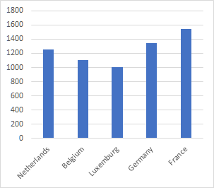
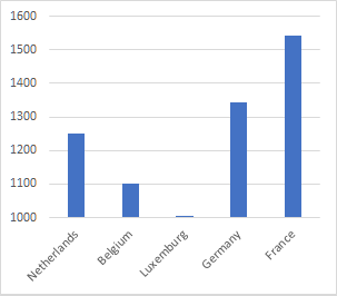
Do look carefully at the scale used on the vertical axis. Both bar charts above show the same data. However, in the bar chart on the right the differences between the countries seem to be a lot larger!
In a bar chart the bars normally are separated.
Some maths books teach they have to be separated, that is not true.
Other forms
Other forms of a bar chart are:
- with horizontal bars instead of vertical.
- the pictogram.
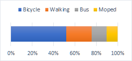
- relative bar chart, the bars are relative (usually a percentage).
- the stacked bar chart, often with relative data.
Below a bar chart with horizontal bars and a corresponding relative bar chart.
How do you make a bar chart?
First you need the data to be sorted/ordered.
Maybe you need to make a frequency table first.
Just like with a regular graph you need the same steps on the vertical axis.
Try to choose the scale in such a way that your axes are about the same length.
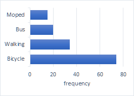
Example
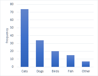
A number of pupils is asked what their favourite pet is.
The results are in the table below. Make a bar chart for this data.
| pet | frequency |
| cats | 74 |
| dogs | 34 |
| birds | 20 |
| fish | 15 |
| other | 7 |
Use grid paper and choose a sensible scale. In this example, 10 pupils per grid square is the best scale. If you use two grid squares per pet, your diagram will be 8 cm by 10 cm. Cats will get a bar with a length of 7.4 cm, dogs 3.4 cm, et cetera.
You will get something that looks like the bar chart below.
What is a histogram?
A histogram is a special name for a bar chart that is made for a frequency table or percentage table with a distribution in classes / grouped data. The variable is measurable and continuous. This means the numbers can have any value and not just whole numbers.
In a histogram the bars are not separated.
A histogram gives a good image of the probability density.
Difference between a bar chart and histogram
A bar chart is made for a discrete data. So almost always qualitative data (nominal or ordinal). A histogram is made for continuous data. So always for quantitative data (interval or ratio).
How do you make a histogram?
First you need to know there are two types of histograms. You can choose to put the frequency or the frequency density on the vertical axis. For the rest it works the same as a bar chart with the difference that in histogram the bars have to be adjacent.
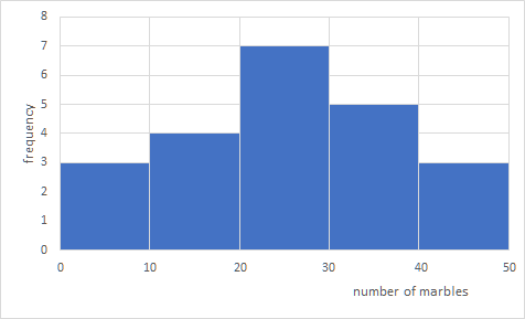
Example 1: frequency
When the classes are all equally wide, you can just put the frequency on the vertical axis.
| number of marbles | frequency |
| 0 - 10 | 3 |
| 10 - 20 | 4 |
| 20 - 30 | 7 |
| 30 - 40 | 5 |
| 40 - 50 | 3 |
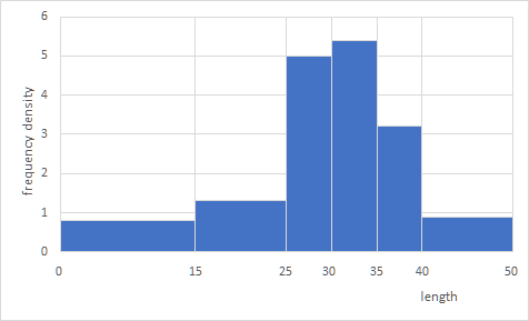
Example 2: frequency density
When the classes in your frequency table do not have the same width, you have to calculate the class density per class (a class can also be called a bin or interval). The class density can be calculated by dividing the frequency by the class width. The frequency density will be on the vertical axis.
The area of the bars will show the frequency.
| length | frequency | class width | frequency density |
| 0 - 15 | 12 | 15 | 0.8 |
| 15 - 25 | 13 | 10 | 1.3 |
| 25 - 30 | 25 | 5 | 5 |
| 30 - 35 | 27 | 5 | 5.4 |
| 35 - 40 | 16 | 5 | 3.2 |
| 40 - 50 | 9 | 10 | 0.9 |